The Meeting Point - Human-Machine Interfaces (Part 1)
Can a poorly designed user interface lead to a large loss? You better believe it.
Who among us has not occasionally hit the wrong button on the remote control, or had trouble getting a device to work correctly because it was left in the wrong mode? Ever leave your smartphone volume up too high after watching a video earlier in the day? In day to day life, the results of these mistakes are just mild annoyances or the occasional ringing eardrums. When we see the same mistakes made with machines, vehicles, or process controls, the consequences can be far more serious.
Large losses resulting from poor interface design are not a new problem. One of the contributing factors to the 1979 Three Mile Island nuclear accident was a poorly designed indicator light. The light indicated when a close command was sent to a valve, rather than activating based on feedback from the valve itself. For several hours, as the situation at the nuclear plant deteriorated, the operators believed the valve was closed when in fact it was stuck in the open position. The resulting confusion delayed proper action for several hours, exacerbating an already bad situation.

The Root of the Problem
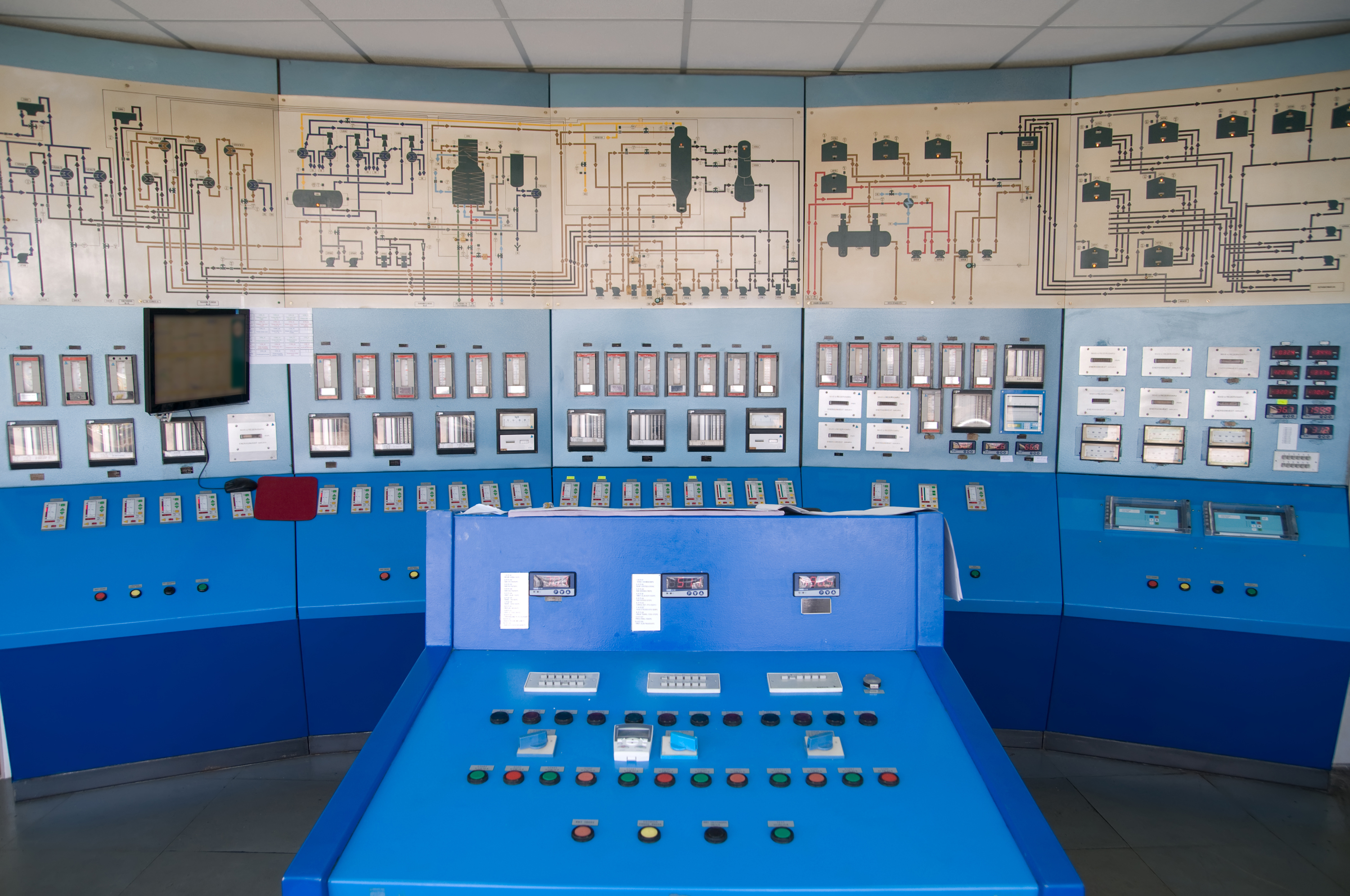
These days, automation is becoming ubiquitous in everyday life. We now automate everything from our homes, to commercial buildings, to industrial plants. As we place the control of increasingly complex machinery and processes into the hands of computers and controllers, the way in which people interact with these systems has demanded increased scrutiny. Investigations into incidents and accidents have repeatedly shown that a poorly designed interface can seriously confuse, impede, or even mislead the people tasked with operating a system. The result of this confusion will inhibit or delay operator response to abnormal situations, turning manageable situations into disasters.
The manufacturers of consumer electronics, such as smartphones and tablets, spend a great deal of time and resources working on user interfaces. A product with a clunky, confusing, or non-intuitive interface will quickly find itself driven out of the market by better-designed competitors. For commercial and industrial control systems however, the design of the interface has historically taken a back seat to other performance measures, sometimes with catastrophic results.
Investigations into commercial and industrial accidents and workplace safety have found that human error caused over 90% of reported incidents. “Human error” can mean a wide variety of things, but a primary factor in commercial and industrial incidents is often a lack of, or loss of, situational awareness by the system operators. The consequences of operators lacking or losing awareness can range from energy waste, to production loss or business interruption, to facility and equipment damage, to environmental contamination, or even injury and death.
Mode Confusion
Mode confusion (sometimes called “mode drift”) is being confused about, or simply forgetting, what mode of operation a system is in. It is simply the result of human nature, but it’s often overlooked when human-machine interfaces (HMI’s) are designed. Who among us hasn’t missed a phone call because we forgot we switched the phone to silent mode during a meeting? It seems like a simple concept, but as the automated systems have grown in complexity, so has the number of modes under which they can operate. The more modes available, the greater the chance of confusion.
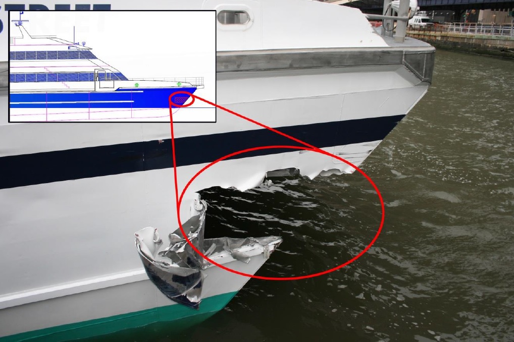
An example of just how dangerous mode confusion can be took place in 2013. The Seastreak Wall Street, a passenger ferry, slammed into a Manhattan pier, injuring 79 people and causing hundreds of thousands of dollars in damage to the vessel and the pier. The ferry captain had selected a seldom-used control mode during the voyage. Forgetting this, when he transferred control from one bridge station to another in preparation for docking, the engines did not respond as expected. By the time the confusion was resolved only a few moments later, it was already too late, and the vessel could not be slowed in time to avoid a collision. The National Transportation Safety Board report on the incident cited, among other factors, that “…the propulsion control system on the Seastreak Wall Street used poorly designed visual and audible cues to communicate critical information about mode and control transfer status”.

The result of mode confusion is not always so dramatic. A commonly encountered issue with building management systems (or alternatively, building automation systems) occurs when a single piece of equipment is left in the wrong mode. Building engineers often have to disable automatic or remote control of a device to perform maintenance. If that device (say a chiller or valve) is left in local/manual control mode and operators are not alerted to this fact, the result can be massive energy waste, flooding, or premature failure of the equipment.
In part two we will discuss digital data, alarms, and how they can contribute to large problems.
______________________________
Read Part 2 here.

